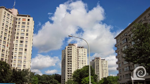
The de facto motorway called Jan DeVoslei has been
covered with two one-way streets along a central strip of greenery and paved
areas. The middle-rise apartment blocks stand proud on either side of this
rather underused public space. Most of the blocks have been placed at an angle
to the road to take advantage of natural sunlight.
Behind the middle-rise blocks along the road amenities
like a school (shown left) have been built. The placement of the middle-rise block
at an angle creates a rhythm along the Jan DeVoslei (right) but also allows the
parklike greenery to penetrate every corner of this neighbourhood.
The building have been designed as freestanding slabs.
Most have been built in a similar manner using the same details and materials.
In the southern part we see some building that have a different skin with a
combination of concrete panels and bricks. These buildings are from the second
building phase and were designed by Maes.
The middle-rise blocks by the architect Smolderen are
grosso modo the same, except for small details, mainly on the ground floor.
Here coloured tiles are used to set each apartment block apart. These tiles that
range in colour from shades of blue via blue green to green, yellow and auburn can
be of a different shape as well.
Behind the row of middle-rise blocks along the Jan DeVoslei
three high-rise towers emphasise the transition to the actual Kielpark behind.
By stacking more dwellings on top of each other more space has been created at
ground level to integrate park and greenery between the apartment blocks. This
creates a flow of space that works really well. Also the towers have less of a
visual impact as they are further apart and enveloped by greenery.
The ground floor of each building has some well
designed details that break the starkness of the overall design and add both
colour and shape. The round windows in the tiles walls provide daylight to the
communal spaces on the ground flour. The entrance has been designed to blend in
with the rest of the ground floor from a distance, but stands out enough once
one gets closer to the building.
From inside the Kielpark the middle-rise blacks are
hidden by the trees, only the high-rises tower over the park. With the trees
planted between the towers the park seems to stretch far beyond, creating the
impression of endless space.
The high-rises are so-called "sterflats"
that consist of three wings around a central core with an elevator and
stairwell. Like the middle-rise apartment blocks (right) the buildings appear
to be elevated on pilotis. In actual fact this is a smart design trick as the
ground floor is mostly enclosed by a wall for the hall and other communal
spaces with the pilotis forming a gallery around this.
The high-rises have been designed as bright towers
with three identical wings where the structure has been used as ornament within
the facade.
The area between the high-rise towers (left) and the
middle-rise slabs (on the right) has been laid out as a parklike area with
playing fields, grass, shrubbery, trees and parking-lots. The massive increase
in car-ownership since the 1960s means that the parking spaces provided are to limited.
This has lead to cars being parked left and right along roads and even on footpaths
and pavements. It seems strange therefore that the entrance to the underground parking
garage is overgrown and clearly disused.
The Kielpark is at the site of the former city
cemetery of Antwerp. The area is elevated as the burial site had to be raised
to be far enough above ground water (which is quite high as the site isn't far
from the Scheldt river). The park has several sporting grounds and a large playground
within it. The res has been planted as one would expect of a post-war public
park with winding paths around a central open space laid to grass with trees
around is as a green belt. The Kielpark has many purple leaved trees in it
(Beech, Maple and Cherry Plum).


No comments:
Post a Comment