
The garden village is characterised by long streets
running from north to south. By using Unwinesque design devises within such a
modernist layout a greater degree of visual interest is created. Here for
instance by bringing forward the building line to visually pinch the view along
the street. The direction of the roof ridge is also employed to create
interest.

The use of green verges in grass planted with trees is
not employed regularly across the garden village. Where it is used the streets
immediately take on a familiar garden village look.

Most streets rely on the green front garden with
privet hedges and low gates to create the garden village feel. the roads have
been turned into one-way streets to accommodate parking spaces for cars. These
were of course not very prevalent when the garden village Moortebeek was
originally built in the 1920s.

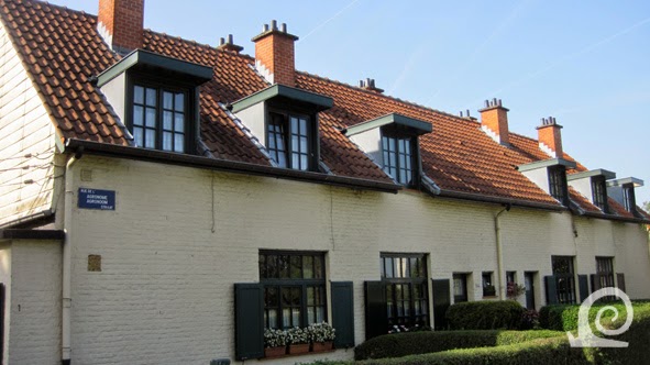
The architecture in the northern part is best
characterised as romantic modernism. All component like windows, doors,
awnings, chimneypots, etcetera, were standardised. The roof shapes vary but are
variations on three basic types. All window frames and doors were (and are)
painted in the same brown colour. The walls are rendered in a an off-white
roughcast or have painted brick facades. The houses were built in classes;
second class houses (left) are simpler in design and smaller in size than the
first class houses (right) with their more expressive design details like this
beautiful sculptural corner.

The streetscape with second class houses makes for a
much simpler design than that of a street with first class houses. The unity in
design, however, creates a pleasant atmosphere.

The Unwinesque devise of the close is also employed
within this garden village. Within this more interesting spatial configuration
the rather simple second class houses look the part and create the impression
of a rural living environment.
The third class houses on the edge of the northern
part of the garden village Moortenbeek are lower and smaller that the second
class housing. The unity of design of the architecture by Jean-Francois Houben
is clear in the overall look and the details.

The use of wooden window shutters creates a rural feel
and also adds a practical detail to the garden village. All houses in every of
the three classes have the shutters, creating great unity throughout. The
central Avenue Shakespeare (right) is a wide, parklike, elongated public garden
with tree lined streets on either side.

Along the sides of the former recreation ground of
Moortebeek two large apartment blocks were built in the late 1950s by modernist
architect René Bragard. At the centre part of the original park was kept as a
public garden with now mature trees. Here a view at the back of one of the
apartment buildings.

The cubist volumes of the building by Bregard (left)
fit wonderfully well with the older architecture in the northern part of the
garden village Moortebeek. The greyish-white colour complements the off-white
of the older architecture. The brutalist architecture around the garden village
makes for an uneasy contrast (shown right). The concrete high-rises and
mid-rises are of an entirely different scale, volume and surface treatment.

The southern part of Moortebeek designed by Joseph
Diongre shows a more expressive take on vernacular architecture making the
whole tie in with of Art Deco. The houses built in terraces all have
alternating architectural expressions. The floor plans, however, are the same.

Two examples of the decorative colour blocking
employed by Diongre to break the facades of his terraced housing. Left a gable
with colour blocking related to the windows and entrance. On the right an
example of colour blocking used to break the length of the terrace by
emphasising the vertical.

With the front gardens surrounded by privet hedges and
uniform gates the garden village feel is also present in the southern part of
Moortebeek. The overall impression is also similar due to the use of the
off-white render on the facades. A one-way system is also in place here to
create space for parking.

The use of colour blocking as a design devise to both
emphasise functional parts of the buildings (entrances) as well as breaking up
the facade and thus down scaling the visual impact can be clearly seen in the
example on the left. In other places blocks of colour are used in a way similar
to natural stone in vernacular architecture, creating a very attractive facade.

In the southern part there is also a distinction
between first class housing, that is larger and decorated in a more elaborate
way, and second class housing with les variation in roof shapes and a more
repetitive decorative scheme of colour blocking on the ground floor only.
No comments:
Post a Comment