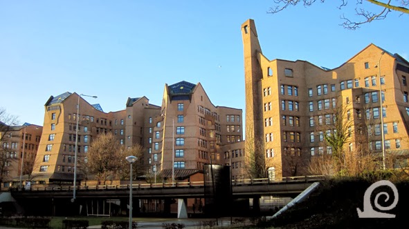
These offices of the former MBN Bank, now the head
office of ING Bank, cradle the Amsterdamse Poort shopping centre. The design is
characterised by an integral approach to building, inside space, environment
and landscape. The office complex is comprised of a series of linked towers
organized in an S-shape around courtyard gardens. Each tower has a basic
elongated hexagonal footprint. In front of the offices one of the elevated
roads is clearly visible.
Amsterdam-Zuidoost is beneath the flight path of
Schiphol Airport. Every few minutes you see a plane come overhead. The distinct
style of architecture by Alberts en van Huut sets these buildings apart from
the uninspired architecture of the shopping centre behind it. In organic
architecture buildings are seen as organisms with nature providing the shapes,
measurements, principles and scale that
should be followed to tune the built environment to the human experience.
Where the temporary service centre stood until the
1980s a new neighbourhood was built in the 1990s. Before that time the area had
been used for singing contest by bird enthusiasts. The name of the new
neighbourhood commemorates this; Vogeljeswei literally means Little Bird
Meadow. All the streets are named after bird species and thus don't follow the alliterative
naming of streets within a neighbourhood. The terraced housing fills a part of
the central strip originally designated for amenities.
An important feature of the original design is the
total separation of through routes per mode of transport. Car traffic runs over
elevated roads that fly over cycle paths and walking paths. Slow traffic is
often combined in parallel paths that run at right angles to the elevated
traffic roads. Large bodies of water crisscross the area. They are needed for
water management, the area is after all a polder with a constantly maintained,
artificial water level on a fixed gauge.
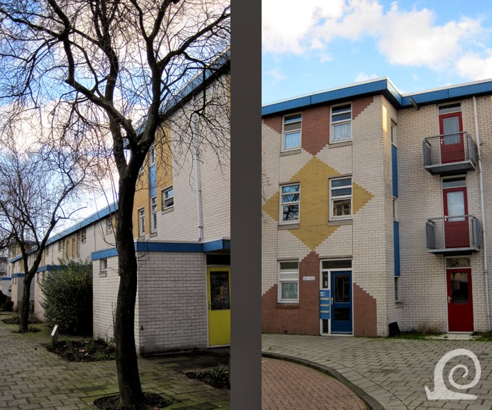
By the end of the 1970s the large scale apartment
buildings were not looked upon very favorably anymore. The western half of the
neighbourhood K was built with terraced housing and low-rise apartment blocks around
communal gardens. So at the heart of the Bijlmermeer we find these buildings
instead of the proposed high-rises.
The architecture is typical of the late 1970s - early
'80s with low-cost materials used in such a way that the overall impression is
somewhat playful. An easy way to upgrade the look of a building is by using
colour in large blocks and brightly coloured doors and window frames.
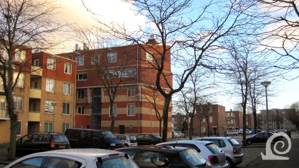
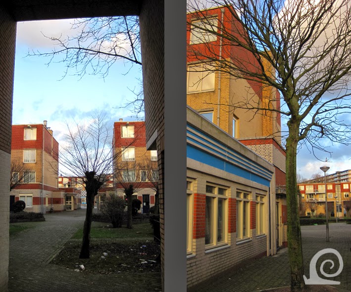
The architecture tries to be functional and use
constructive elements as ornament. Parking was factored into the design of
these spaces. On the inside of every apartment block there is a communal garden
space with plants, benches and a play area.
These low-rise apartment blocks make up half of the
1980s section of the neighbourhood K. The 404 dwellings have been built in 1985
with public amenities included in the corners. A central axis with a walking
path connects the various garden courts.
The bright new future of urban living was envisaged as
high-rises set in continuous parkland with no traffic on ground level. With a
ray of sun hitting the side of these hexagonal apartment buildings they don't
look half as grim as people tend to view them. The apartments are spacious and
the scale is enormous, so there is a great sense of open space.
The entrances are often slightly hidden. Here the entrance
to Kikkenstein, one of the high-rises destined to remain. Some of the hexagonal
building have been renovated with special attention paid to the entrances,
making these more obvious and safer.
A view across the parkland in between the hexagonal
high-rises. The elevated metro line runs through the middle of the picture. The
park is only accessible to pedestrians and cyclists.
Along the Bijlmerdreef (that has been lowered east of
the Gooisedreef) the parking garages have been demolished. The derelict
shopping centre in the undercroft of one of these garages named Kraainest has
been torn down together with parts of the other garages and high-rises. Here
the old (white) in the new (red brick) blend well together, because the new
buildings have a large footprint and comparable height.
Where the hexagonal high-rises have been demolished
they have, for the most part, been replaced by terraced housing and low-rise apartment
blocks. All of the parkland has been parceled off, leaving strips of greenery
in places. The reuse of older park land in this way does give the new green
structure a great sense of maturity.
As everywhere in the Netherlands there is great need
for parking space. In an urban environment this doesn't just apply to cars but
also very much so to parking space for bicycles. Here they are parked right in
front of these family houses. Along the central axis of the Bijlmerdreef the
buildings are higher. They often have commercial space on the ground floor with
apartments above. The style of architecture is similar with the use of the quintessential
red brick.
A view along a new street with low terraced housing on
both sides. All the roofs are flat. In places older trees have been spared
during redevelopment. This picture, however, could be taken in any Dutch city.
The architecture is definitely of its time. These new
terraces combining natural stone and wood are a good example of contemporary
architecture. The same rows of houses are repeated street after street. This
makes for easy redevelopment but hardly tackles the monotony so maligned by
critics of the high-rises. Luckily the water structure of wide water courses
had to be retained. This creates space in the sea of similar houses and also
aides orientation.
In the redeveloped former parkland the structure of cycle
paths that are aligned along the grid have been retained and form the backbone
of the new green structure. In the Netherlands designated cycle paths and cycle
lanes are always coloured red.
A peak through along the Bijlmerdreef from underneath
the Gooisedreef with more new development along the western part of this road.
Here however the road climbs to the old elevated level that has been retained
for the section between the Gooisedreef and the new station.
These apartment blocks along the elevated section of the
Bijlmerdreef are characterized by their contemporary but fashionable
architecture. These buildings replace the large parking garages that once lined
the elevated infrastructure on the ends of the hexagonal high-rises.
In places the architecture of the new apartment blocks
is even more fashionable than around it. Behind the higher buildings along the
Bijlmerdreef (and the other elevated roads) the space once occupied by a
hexagonal high-rise has been filled with terraced housing.
Here a good example of how the new buildings try -but
fail- to engage in a dialogue with the remaining sections of high-rise
buildings behind it. Personally I think it doesn't work to leave parts of the
hexagonal structure intact as done here. It's better to demolish the whole thing, than
leave parts in place and still build over the surrounding parkland. This
creates a strange contrast between the stark high-rise sections and the lower
houses around it. These high-rises were after all designed to be surrounded by
greenery and set in ample half open space.


No comments:
Post a Comment