The SiedlungMargarethenhöhe comprises of several building phases that can be aggregated
into two spatial section on either side of the main thoroughfare called
Sommerburgstrasse after the castle that once stood here. These impressions will
be of the second section around this road that was built between 1930 and 1938.
The main thoroughfare of Sommerburgstrasse curves
around the oldest part of Margarethenhöhe. Through the centre of this avenue
the tram line runs. The 1930s apartment blocks that line this avenue on the
outside are higher than the 1920s housing along the edge of the older section
of the garden city.
The 1930s buildings also feature wooden window
shutters, some sash windows, but mostly folding windows and the typical hipped
roofs. Many facades are smothered by Virginia Creeper (Partenocissus).On the
edge of the 1930s section the new police station was built with a rather large
and non-functional stepped gable dominating the design.
The first building phase still used an Unwinesque
device at the access point with the street forking around a terrace with a
large dormer in the axis of the road.
The houses are generally larger in this section, as
these semidetached villas clearly show. Also here greenery in the shape of
front gardens or public greens are an integral part of the street scene.
Originally all houses had privet hedges along the street.
Here a narrow green verge planted with trees and
shrubs separated the street from the pavement. The cars that are now parked
everywhere where never envisaged when this design was made. The buildings are
spaced liberally with gardens in-between creating a more open feel within this
section of Margarethenhöhe.
The more sober detailing is typical for development of
social housing from the 1930s. The entrances to the apartment blocks al show a
clear vertical accent in a facade dominated by horizontal bands of windows. In
some examples a vertical window provides light to the stairwell and signifies
the entrances that is emphasised by a simple brick surround (left). In other
blocks the entrance has been set-back as a sculptural recess (right). Within
this overall shape the design again emphasises the horizontal in all its elements.
In some streets the green verge has been replaced by
parking provision. This detracts from the originally intended streetscape.
Luckily larger trees haven't all been chopped down, as is so often the case in
privatised garden villages.
The 1930s section of Margarethenhöhe is dominated by
apartment blocks that create a much larger scale of housing. The shift
coincides with a shift in design focus towards New Objectivity. Thus the type
of building chosen is based mainly on demand and demographic statistics.
Without the Virginia Creeper the simple horizontal facade with a vertical
accent at the entrance is very clear to see.
Demographic statistics also meant the inclusion of
bungalows for elderly people. These houses also have the typical window shutters
and hipped roofs. Later the attic has been made liveable by the addition of
roof lights.
The apartment buildings all share a similar layout.
They differ mostly in the details, like for instance the balconies and the
dormers. Small details like a protruding edge at a corner stairwell signify a
different floor plan.
The treelined streets offer a lovely suburban living
environment. The mature trees scale down the large apartment blocks. The
non-urban feel is helped greatly by the curtains of Virginia Creeper on the
facades.
The avenue separating both sections originally had
trees along one side. In some places these have survived, which in combination
with the tram rails set in grass creates a much softer feel. The street also
seems wider with the central band of grass.
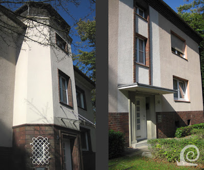
The final building phase was designed is a totally
different style with rendered white facades dominating the streetscape. The
buildings and floor plans are however very similar to the other buildings in
roughcast and brick.
The buildings are rather modern in design despite
dating from the 1930s. The architect has included details in brick to make the
designs "more German". Thus the ground floor is executed (in part) in
brick. Vertical accents at the entrances are designed as turrets with their own
roof. In other blocks colour blocking in combination with vertical bands of
brick are used to break up the facade into vertical sections.
On the edge of this section a small green with
terraced housing was added. This feature is incidental and doesn't follow
Unwinesque design principles as all the terraced housing is placed for maximum
sunlight and air. Again this is more New Objectivity (Neues Bauen) than typical
English garden city architecture.


No comments:
Post a Comment