Monday, October 24, 2016

Hermeswiese, Vienna: an example of mixed social housing


The edge of Hermeswiese II consists of a long row of short terraces along a village green-like public garden. These houses mark the edge of the estate to neighbouring Speising, a former village now absorbed into the Viennese Metropolitan Area.The houses are rather simple with rendered facades in ochre tones with red clay tiles on the roofs.


The formal entrance to the northern section is formed by this gatehouse crowned with a clock tower. The housing behind is arranged in staggered rows of terraces.


The second street of the northern section also has a formalised entrance here as a gate with posts. At the entrance a text in metal letters on the side facade commemorates the Building Society responsible for this housing project.


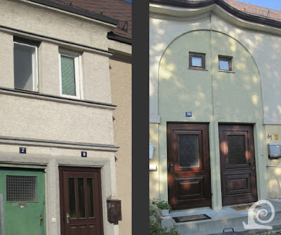
The houses were built by the participants in the Building Society (as such it is a Building Cooperative). They are thus rather simple in construction and decor. Brick surrounds emphasise the entrances. In other places the entrances are combined and placed under a low roof in a porch. The use of simple colour blocking to create visual interest can also clearly be seen.


To make the long streets of the northern section more interesting an Unwinesque device is employed in the design. Some sections of the housing is set back from the street creating spatial division an framing of the view along the street. The front gardens are often merely a narrow strip bordered by a privet hedge.


The main entrance to the municipal section leads via this double gateway (left) through the long wall along the Speisinger Strasse. Here the architect used white render with brick detailing on corners. The whole is a sculptural predecessor of the much larger Karl-Marx-Hof. A similar but smaller gate connects the two sections of this housing estate. A simple arch in soft yellow shows some of the ochre housing behind. The building again features brick accents, mainly on the corners.


These more ornate terraces can be found in the municipal section (Hermeswiese I). Here the lengthy row of housing is broken up visually by the use of flat protruding turrets, triangular gable ends and a pergola on concrete pillars.


Two details of the front with these sensuously curved balconies which create shadows that add to the sculptural quality of this apartment building.


A cul-de-sac in the municipal section with simple housing, partly built by participants of the collective.


Around the small square behind the formal wall most of the housing is an extension of the white render and brick combination at the front. The blocks are again sculptural, but seek to form a bridge between the higher wall and the standard terraced housing. A small gateway connects the square to one of the cul-de-sacs.


A view across the small square, the first of a sequence, loosely based on the ideas of Camillo Sitte. Here the white render dominates, with on the one hand flat roofs and cubist shapes, and on the other a more vernacular idiom again with brick details.

Thursday, October 20, 2016

Hermeswiese, Vienna: housing provision as a communal effort


In contrast to the very urban blocks of the Gartenhofsiedlungen (Garden Court Estates) some of the housing estates of the Rotes Wien have a more village-like feel. As with other such garden village type housing estates the Viennese council worked closely together with a so-called Baugenossenschaft in developing the Siedlung Hermeswiese. The municipal housing was designed in such a way that it would form a unit with the Colony Lainz-Speising, to be developed by the Genossenschaft Altmannsdorf-Hetzendorf. The first is also known as Hermeswiese I, whilst the second was later dubbed Hermeswiese II. The designer of the estate was Karl Ehn, who would later create the iconic Karl-Marx-Hof.

The housing was initially planned for workers at the city electricity works, but during the design process the estate was opened to a wide variety of participants. Every prospective resident had to become a member of the Building Society (a Baugenosse) and put in at least 1000 hours of manual labour. This way the housing could be built at a low cost. The council guaranteed the loan for the land and the materials. As such this garden village estate is the result of a building collective. Such Baugenossenschaften were quite common even before the publication of Ebenezer Howards seminal book on Garden Cities, but flourished as the ideas of the Garden City Movement spread across the German-speaking countries.

The estate of Hermeswiese is a introvert unit that has been designed as a single recognisable suburban entity. It was developed in meadows along the Hermesstrasse -hence the name- that leads to the Hermesvilla, a former royal residence in the beautiful Lainzer Tiergarten. At the edge of the site the Lainzer Bach -a stream that rises in the Lainzer Tiergarten- feeds a pond and then disappears into a culvert.

The whole estate was designed with the human scale in mind, creating a more intimate living environment than the bold Gartenhof Estates that would follow. Totally in keeping with Garden City ideals the housing references vernacular architecture en the spatial configuration of a village. This shows clearly in the archway that gives access to the estate from a park along a thoroughfare. The building is embellished with a low clock tower above the entrance. A fountain, replicating many such features in villages in the Austrian Alps, further enhances the scene.

Although Ehn made sure the architecture united both sections of the estate, they differ greatly in layout. The northern section is comprised of two straight streets that were laid out parallel to the elevated Hermesstrasse. To avoid formality in these streets the building line was staggered, long and short terraces were alternated and in the middle the street was widened and amenities were planned adjacent (like a school). The southern part was designed along the ideas of the Austrian architect Camillo Sitte which influenced the spatial progression of urban wall with gateway, square, street and small square with gateway, whilst the staggered building line and cul-de-sacs are typical Unwinesque design principles. In this section a sculptural winged block of apartments marks the edge of the estate along the street. It also forms a spatial pendant to the Church of the Orthopedic Hospital across the Speisinger Strasse. The architecture of the southern -municipal- section is more ornamental than the northern section. The whole estate was built in 2 building phases: 1923-1927 and 1927-1929.


The Hermeswiese Estate comprises of two sections that were built separately but under a unifying design. The design included a public park (Andreas Rett Park - R) and allotments with sheds for keeping small animals like geese, chickens, pigs and goats. These have now disappeared however. Hermeswiese I comprises of a large apartment building in several linked sections (A) at the front with a village-like street with two squares (S) and cul-de-sacs (C) behind the gateway (G) and a gateway connecting this section to Hermeswiese II. This northern section also has a long front along a street with a gateway (G) with a central section where a school was planned behind a block of flats for single workers (F). Instead new housing was built on the reserved site (N) in 1930.

Monday, October 17, 2016

Autumnal: flurry of fungi


Autumn is associated with mushrooms and toadstools of all kinds. In fact these can be found throughout the year. Both are manifestations of fungi that are otherwise invisible growing underground or in wood or other decaying material. Most fungi are beneficial however and provide plants with vital nutrients and water as mycorrhiza. Some of these also show themselves as toadstools, as these are the reproductive bodies of these organisms. Fungi should not be called plants, as they are a separate branch of the tree of life more closely related to animals than plants!


Mushrooms can be found everywhere, not merely in woodlands. Some grow on the woodland edge and in parks (left) others pop up in a carpet of moss in the heart of the forest with little light (middle). The name mushroom is said to be derived from the French word for moss. Toadstools also grow in meadows and grassland, even in lawns.


These tiny toadstools grow from a mossy stump of a dead tree (left). These are from a type that lives of dead wood. Other mushrooms grow amongst the grass. Here (middle) some emerging ones, that look almost hairy. Another cluster mushroom is this yellow-capped saprophyte that grows amongst the leaf litter of oaks on the woodland floor. These types are important for recycling nutrients.

Thursday, October 13, 2016

Am Freihof: soft colours and colour blocking in vernacular architecture


The most prominent feature of this garden village 'Am Freihof' is a curved avenue of trees lined with houses on either side. It is not a formal feature as this wide curved street doesn't connect anything. It does however create a great sense of s[pace at the heart of this housing estate.


In keeping with the design idiom of the Garden City Movement planted verges feature as part of the design. Most are planted with small fruit trees or ornamental blossoming trees. As with other housing estates funded or planned by the Viennese council, this estate has a commemorative text in metal letters attached to the side of one of the houses on the entrance from the through route to the centre of Vienna.


Closes are a way of maximising parcellation. Here the closes are always located at the centre of a block. The houses are placed at the end of a cul-de-sac, often around a small expanse of grass. As a result of the large gardens in this garden village, the closes are placed rather far back. They are thus more isolated incidents than a visual feature.


The houses are typically rendered and painted in soft tones. These tones vary, although the houses in building phase 2 all share these yellow and ochre tones. Large gateways give access from the curved avenue to the streets behind. Here a small garden creates visual interest and also marks the axial shift in the street line.


These houses were built prior to the development of this garden village by two cooperating Building Societies (Baugenossenschaften). They are very similar to the later housing.


Very simple ornamental feature break up the terraces and create interest in the facades. In some buildings the entrances are emphasised by a slightly protruding surround with a moulded edge in a darker colour. Also note the band below the window on the first floor. In other places a difference in colour is used to emphasised the windows and doors by painting a frame around them.


By staggering the building line -another Unwinesque design solution- streets are made to appear shorter. A difference in roof shape and height of the facade is also employed here to create visual interest and variation.


As these are owner-occupied houses, homeowners have put their mark on the building, often by the use of colour. The original pea green has been painted over with pink paint (on the left). Also note the tiny gable end in the pink building, used to break op the long line of the roof. Some buildings have these large concrete frames emphasising some of the entrances. Here with an original floral ornament above the entrance. The awning is a personal addition of the owner.


Around the central square several shops were incorporated into the plan. The rectangular shape is emphasised by the closed facades around. Here the shop fronts on the ground floor are emphasised by the use of brick with the standard yellow render above. Also note the round "tower" in the corner.


Some examples of more elaborate ornamentation around the entrances. The entrances are combined per two and located in a protruding section with ornamental ribbed bands dividing the facade. This secession inspired entrance again features a combined entrance of two homes in a terrace. Her the roof is raised slightly and a panel (slightly recessed) with a generous arc surrounds the doors and the windows of the bathrooms above.


These semidetached properties break up the rows of terraced housing along these typical garden village streets with grass verges planted with blossom trees (Rowans here). Again the awning by the entrance is a later addition. All front gardens were originally planted with a privet hedge.


Some of the details show the architect drew inspiration from modernist buildings as well as vernacular architecture. These flat elongated sections of the facade are a feature in the first two building phases. Sometimes they are used to emphasise a corner where two streets meet. In other places these features are used to break the long facades and roofs of the terraced housing.


The housing of the third building phase features longer terraces with little ornamentation, except for a crimped roof edge and colour blocking around the entrances.


Another example of colour blocking (left). Here the staggered building line is emphasised the squared-off shape and by painting the protruding corner a green colour to contrast with the section of the terrace placed further forward. On the right a more subtle example of colour blocking with a raised panel around the windows in a different colour. Also note the roof trim treatment with small ornamental triangles.


The housing in the last building phase is more plane with little ornamentation. The roofs are typically hipped. But the sections with the entrances have a flat roof with a wide rim in wood.