Wednesday, October 28, 2015

Colourful city: autumn has arrived!


Some people think I favour autumn over all other seasons. That isn't true as I like all seasons except winter... The magic of autumn is when all the leaves start turning and reveal their often bright goodbye-colouration. Streets, parks and gardens are suddenly, and only fleetingly, ablaze with colour. And then the leaves drop and litter the streets and lawns for a while before becoming worm food.


The colour spectacle of the autumn leaves draw people to the parks. Here they can see the Virginia creeper (Parthenocissus quincefolia) with its big leaves turning pink hugging a tree trunk. The grass is littered with leaves in various shades. Some trees like the Silver Maple (Acer saccharinum) have leaves that turn both red and yellow (middle).The crab-apples mostly hold on to their fruit, but underneath some trees the ground is littered with these small yellow apples.


A few gusts of wind are enough to send the leaves down from the canopy. These leaves on the pavement were shades of red whilst on the tree (Zelkova serrata) but quickly take on rusty tones when on the ground. A garden path is sprinkled with these deep red maple leaves (middle). The Scarlet Oak (Quercus coccinea) was named for its autumn leaves in shades of red. Here they have fallen on some steps in a park.


Maples are one of those trees that provide maximum interest this time of year. Especially the types from the far east combine interesting finely cut leaves with splendid autumn colours. The Japanese Maples have small leaves with many lobes. The leaves of Acer palmatum with their bright red tones litter the undergrowth. Acer japonicum 'Aconitifolium' has deeply cut lobes on leaves that are just turning a deep burgundy colour. Another Acer palmatum is almost on fire in the afternoon sun with leaves in yellow, and orange.


Although nature is winding down for winter some plant still produce flowers. Many late insect are very thankful for this late nectar as this group of Michaelmas Daisies is providing. Slower as a result of the lower ambient temperature this is the moment to photograph some butterflies feeding on these purple blooms. All species of butterfly are common in parks and gardens where I live: the Cabbage White (left), the Little Map (middle) in its summer colours (the autumn brood is typically black with white and brown markings) and Red Admiral (right).

Wednesday, October 21, 2015

Window box 7: beyond bold


As stated before I like bright colours and colour contrasts. Some people agree with me and make their window boxes into statements of optimism and pleasure by combining bright flowers and colourful foliage plants. Most dull streets need such bold injections of colour!


French Marigolds are most often used in bedding displays, but are equally happy in window boxes. Here  the blue container contrasts nicely with the orange flowers (left). Peppers are best known as a spicy ingredient of Asian and South American cuisine, but they can be decorative in their own right. In the centre a nice combination of compact red and yellow varieties. The semi double flowers of the begonia in electric orange draw attention from a distance. Again the blue planter is a good choice providing a nice contrast with the flower colour.


Not just flowers can provide bold displays as this combination of red flowers (Zonal Pelargonium) and red leaves (Painted Nettle) shows clearly. In the middle another variety of Painted Nettle (Plectranthus more commonly known as Coleus) with red leaves edged golden. A similar colour combination is provided by this Oxalis vulcanicola with deep maroon leaves under small bright yellow flowers.

Friday, October 16, 2015

Margarethenhöhe, an exemplary German garden city: Part 2


The SiedlungMargarethenhöhe comprises of several building phases that can be aggregated into two spatial section on either side of the main thoroughfare called Sommerburgstrasse after the castle that once stood here. These impressions will be of the second section around this road that was built between 1930 and 1938.


The main thoroughfare of Sommerburgstrasse curves around the oldest part of Margarethenhöhe. Through the centre of this avenue the tram line runs. The 1930s apartment blocks that line this avenue on the outside are higher than the 1920s housing along the edge of the older section of the garden city.


The 1930s buildings also feature wooden window shutters, some sash windows, but mostly folding windows and the typical hipped roofs. Many facades are smothered by Virginia Creeper (Partenocissus).On the edge of the 1930s section the new police station was built with a rather large and non-functional stepped gable dominating the design.


The first building phase still used an Unwinesque device at the access point with the street forking around a terrace with a large dormer in the axis of the road.


The houses are generally larger in this section, as these semidetached villas clearly show. Also here greenery in the shape of front gardens or public greens are an integral part of the street scene. Originally all houses had privet hedges along the street.


Here a narrow green verge planted with trees and shrubs separated the street from the pavement. The cars that are now parked everywhere where never envisaged when this design was made. The buildings are spaced liberally with gardens in-between creating a more open feel within this section of Margarethenhöhe.


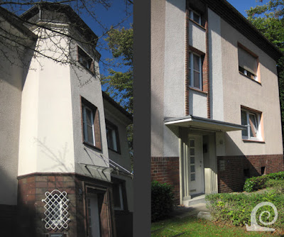
The more sober detailing is typical for development of social housing from the 1930s. The entrances to the apartment blocks al show a clear vertical accent in a facade dominated by horizontal bands of windows. In some examples a vertical window provides light to the stairwell and signifies the entrances that is emphasised by a simple brick surround (left). In other blocks the entrance has been set-back as a sculptural recess (right). Within this overall shape the design again emphasises the horizontal in all its elements.


 In some streets the green verge has been replaced by parking provision. This detracts from the originally intended streetscape. Luckily larger trees haven't all been chopped down, as is so often the case in privatised garden villages.


The 1930s section of Margarethenhöhe is dominated by apartment blocks that create a much larger scale of housing. The shift coincides with a shift in design focus towards New Objectivity. Thus the type of building chosen is based mainly on demand and demographic statistics. Without the Virginia Creeper the simple horizontal facade with a vertical accent at the entrance is very clear to see.


Demographic statistics also meant the inclusion of bungalows for elderly people. These houses also have the typical window shutters and hipped roofs. Later the attic has been made liveable by the addition of roof lights.


The apartment buildings all share a similar layout. They differ mostly in the details, like for instance the balconies and the dormers. Small details like a protruding edge at a corner stairwell signify a different floor plan.


The treelined streets offer a lovely suburban living environment. The mature trees scale down the large apartment blocks. The non-urban feel is helped greatly by the curtains of Virginia Creeper on the facades.


The avenue separating both sections originally had trees along one side. In some places these have survived, which in combination with the tram rails set in grass creates a much softer feel. The street also seems wider with the central band of grass.


The final building phase was designed is a totally different style with rendered white facades dominating the streetscape. The buildings and floor plans are however very similar to the other buildings in roughcast and brick.


The buildings are rather modern in design despite dating from the 1930s. The architect has included details in brick to make the designs "more German". Thus the ground floor is executed (in part) in brick. Vertical accents at the entrances are designed as turrets with their own roof. In other blocks colour blocking in combination with vertical bands of brick are used to break up the facade into vertical sections.


On the edge of this section a small green with terraced housing was added. This feature is incidental and doesn't follow Unwinesque design principles as all the terraced housing is placed for maximum sunlight and air. Again this is more New Objectivity (Neues Bauen) than typical English garden city architecture.

Tuesday, October 13, 2015

Margarethenhöhe, an exemplary German garden city: Part 1


The Siedlung Margarethenhöhe comprises of several building phases that can be aggregated into two spatial section on either side of the main thoroughfare. These impression will be of the oldest section within this road that was built between 1909 and 1928.


This gate building gives access to the garden city Margarethenhöhe in a formal way. the relative elevation of the site is further emphasised by the stairs in the axis of the bridge that connects it to the city centre of Essen. The deliberate use of colour blocking and an elevated volume with an ornate hipped roof with mansard skirts coupled with the strong symmetry of the windows, dormers and arches and emphasise this building as pivotal.


In the oldest streets directly adjacent to the gate building the streets lack front gardens and are built along a narrow raised pavement on either side of a paved road (now in asphalt). The deep eaves, angled out roof skirts and often protruding first floor make for a typical streetscape reminiscent of medieval German towns.


A typical example of Unwinesque design principles can be seen in the treatment of this corner. Three streets meet at this point. The streets meet at an angle and the space opens up into a separate paved open space. The contours are defined by the placement of the buildings, both terraced and semidetached housing.


Conform the examples mentioned in "Das Englische Haus" many houses have a differentiated treatment of the facade especially in the materialisation of the elevation. On the left an ornate example of a gable end with a wooden plank infill over a rough cast under storey. O the right an example where the bottom section of a terrace has been emphasised by the use of a decorative border over a smooth rendered surface containing the doors and windows.


Roughcast is the material of choice for the facades in the earliest building phases of Margarethenhöhe as this streetscape shows clearly. Long terraces are broken up visually by vertical accents in render or stone work. short terraces and semidetached houses are designed with decorative bands and intricate complex roofs, often with large dormers to create interest and shorten the apparent height of the buildings. Front gardens are still incidentally used.


In the 1920s brick is used to great effect as shown on the right. Brick buildings also lend themselves to the use of decorative wood work as functional ornament. On the left the eaves are painted white like the sash windows and the little railing and support for window boxes. In Germany there really should be red Pelargoniums cascading down this corner...


Along the southern edge of Margarethenhöhe the intersections of streets have been expanded into small garden squares. The buildings show a mix of brick, roughcast and rendered facades. The central space is emphasised by the placement of the buildings, with the inclusion of typical Unwinesque angles housing on an inward corner.


Margarthenhöhe has no green closes but street closes where a narrow street gives access to one or more blocks of terraced housing placed back from the street behind the gardens of the other buildings. Here a large dormer on the hipped roof emphasises the axis of symmetry of the access road.


Equally symmetrical is the large garden square -Haux-Platz- in front of the Waldlehne School. On each corner a small pavilion was built emphasising the shape and the axiality of the design.


Somewhat to the side of the Haux-PLatz the catholic church of the Holy Family is situated (shown left). This building is the second incarnation of this building that was destroyed in WW2. The axis of the Haux-Platz is continued across the Robert-Schmohl-Platz via two opposing gates in brick topped by a sculpture.


The Robert-Schmohl-Platz resembles a small-scale version of a Gartenhof like those pioneered in Vienna some 15 years earlier. Around al large communal garden with playgrounds (and nowadays parking for cars) apartments and terraces are combined in large, mostly three storey sectional blocks.


Within the oldest section of Margarethenhöhe heavily contrasting styles of architecture give expression to the ideals of a Germanic garden city. On the one hand there is the vernacular architecture inspired by the southern German hills where the head architect Metzendorf came from originally. Here sections of the elevation often protrude and the buildings have eaves over wood-clad gable ends (shown left). On the other hand there is a more decorative style of architecture that references baroque examples and gives them a modern twist like the bell gable with horizontal bands on the right shows clearly.


In the old section of Margarethenhöhe family housing dominates, but occasionally apartments have been included, especially after 1925. These larger blocks with their hipped roofs and small dormers fit well within the overall garden village on account of their similarities in design and materialisation.


The Gustav Adolf Haus harbours the evangelical community of Margarethenhöhe. This striking building rendered peach owes as much to vernacular architecture as it does to the style of New Objectivity.


The Small Market forms the heart of the garden city. It comprises of a lowered market square with long blocks of terraced housing on either side. As this was a prime location the buildings are very detailed with loggia's on the first floor and vernacular windows and doors in moss green with wooden window shutters.


At the centre of the Market Square a fountain was built opposite the Gasthaus (literally Guest House now a hotel), originally a boarding house for unmarried employees of Krupp. It is now a hotel. Directly opposite the Gasthaus the Konsumanhalt (now a super market) was built where the residents could uy all house hold goods and supplies.


The Gasthaus still forms the focus of the Market Square. The building is highly decorative and rendered bright white to separate it from the housing (much like the stone-clad Konsum opposite).On the right the market stalls covered by a corrugated iron roof, that was off course made in the Krupp iron works.